
In the course of my job, I spend a lot of time with budding graphic designers, marketing students, and the like. Often, they’ve received some Rhode Island-centric assignment that will include a logo. Drawing a logo that represents Rhode Island can be relatively difficult if you’ve given it some thought. The anchor can be too official, given that it appears across State departments and branches. The quahog is indistinguishable from any other clam to the average person. So what does that leave us with? Well, the tried and true method is a silhouette of Rhode Island.
So it’s fair to say I’ve seen a lot of silhouettes of Rhode Island. And my feedback is almost rote now. “Where’s Block Island?”
To be fair to many of those who send the silhouettes to me, Block Island isn’t nestled as close as the other islands. But it’s roughly 75% larger than Prudence Island (and about 12x more populated) and Prudence almost always appears in a Rhode Island silhouette – albeit, often with a new landbridge between it and Patience Island.
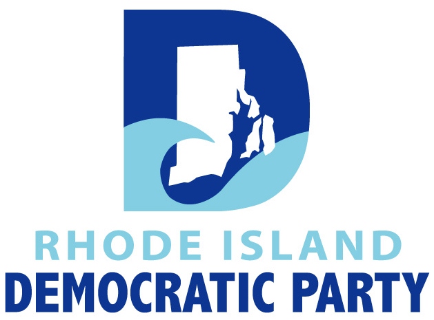
But what would this article be without examples? The most glaring examples tend to come from Rhode Island’s political community. Here’s the Rhode Island Democratic Party’s logo (which eliminates not just the typical biggies of Block Island and Prudence, but also Jamestown’s island home of Conanicut):
Here’s the late Anchor Rising logo:
![]()
And in case you missed it up at the top of the page, RI Future’s current logo:
![]()
Over time, I’ve gotten into an ongoing Twitter back-and-forth with @Blockislandinfo about their missing island, and it’s yielded gems like this one:
@SamGHoward left off another one. pic.twitter.com/YyBZXkhNWj
— Block Island Tourism (@Blockislandinfo) May 23, 2014
That’s from GrowSmart RI’s Power of Place summit, which was all about Rhode Island.
That said, I’ve seen some examples of including Block Island. For all of its faults as a logo, the RI Welcome Back Center‘s logo at least contains Block Island. Foolproof Brewery also uses an RI silhouette that includes Block Island to show where in the state it’s brewed:
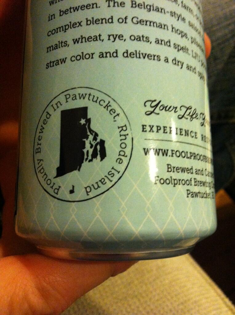
And that example shows that you can include Block Island and still make a design that looks good, even if you’re restricted by having to make a circular one. And this is important, because there was once talk of secession on our small southern island. Maps matter, and Rhode Island is small enough already without ignoring bits of it – especially important tourism-generating bits.
P.S. Some other odd configurations of the Rhode Island silhouette I’ve seen: Rhode Island as a single landmass sans B.I., Rhode Island missing all islands (and thus missing the “Rhode Island” part of it), and Rhode Island including Bristol County, MA.
If you see any more examples of odd Rhode Island silhouettes, feel free to tweet me (@SamGHoward) or post them in the comments below.